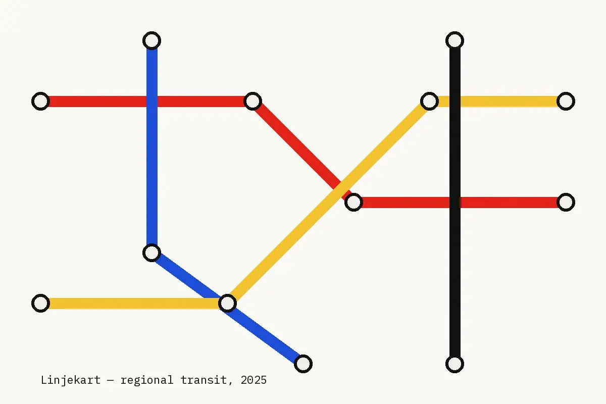
The regional transport authority asked for a map that would fit on a bus shelter panel and still make sense to a first-time visitor. Geography had to give way to clarity.
We simplified the network into straight runs and forty-five degree turns, kept the four line colours from the existing fleet and gave every interchange the same white circle with a heavy outline.
A diagram is a promise that the city is simpler than it looks.
The diagram was tested with groups of commuters and tourists before printing. Two stations moved, one name became shorter and the yellow got slightly darker so it would print reliably outdoors.