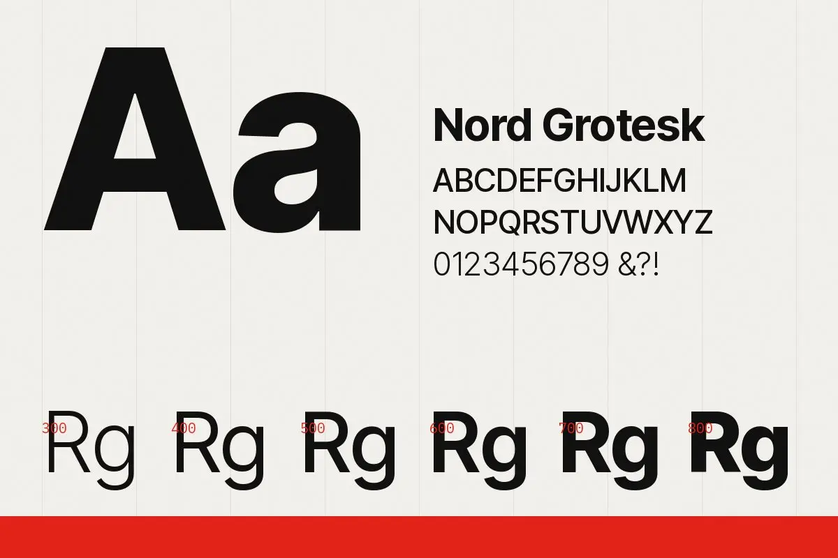
Nord Grotesk began as lettering for the Harbour Line signs and grew into a full family. Its proportions come from the sign panels: slightly narrow, generous counters, and an uppercase that holds up at a distance.
We drew six weights, from light to extra bold, and kept the spacing loose enough for small sizes. The figures are tabular by default because so much of public information is numbers: platforms, times, gates.
Design notes
- A single-storey g for clarity at small sizes
- Short descenders so tight line spacing works on signs
- An arrow set drawn to match every weight
The family is now used across all of our wayfinding projects and is available to clients under a studio licence.