Kunsthalle Vestre shows six exhibitions a year with a team of five. The old identity needed a designer for every poster. The new one had to be something the team could run themselves, without losing its character.
Three shapes, one grid
We reduced the identity to a circle, a triangle and a stack of bars, each tied to one of the hall's programme strands: light, mass and rhythm. Every poster places one shape on the same twelve-column grid, and the exhibition title always sits at the bottom left.
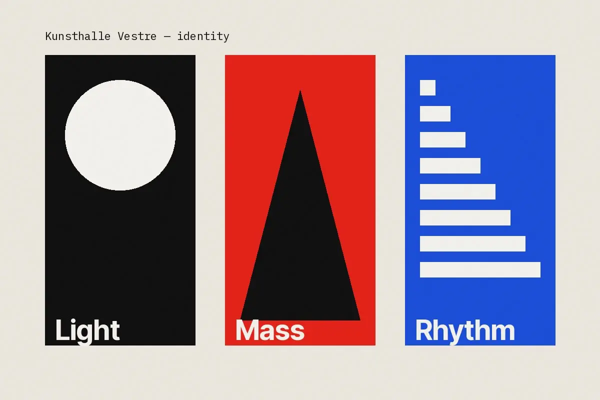
- A poster template for print and screens
- A typographic system with two weights
- Signage for the entrance and the courtyard
- A short manual the staff actually read
Two years on, the hall has produced over forty posters in-house. None of them look the same, and all of them look like Vestre.
For the first time, the posters feel like part of the building.
Director, Kunsthalle Vestre