Pebble helps people put away small amounts of money every day. Their old brand looked like every other bank: navy, serious and a little bit scary. Their customers were mostly people saving for the first time.
The brief, in one line
Make saving feel like a game you are winning, without ever feeling childish about money.
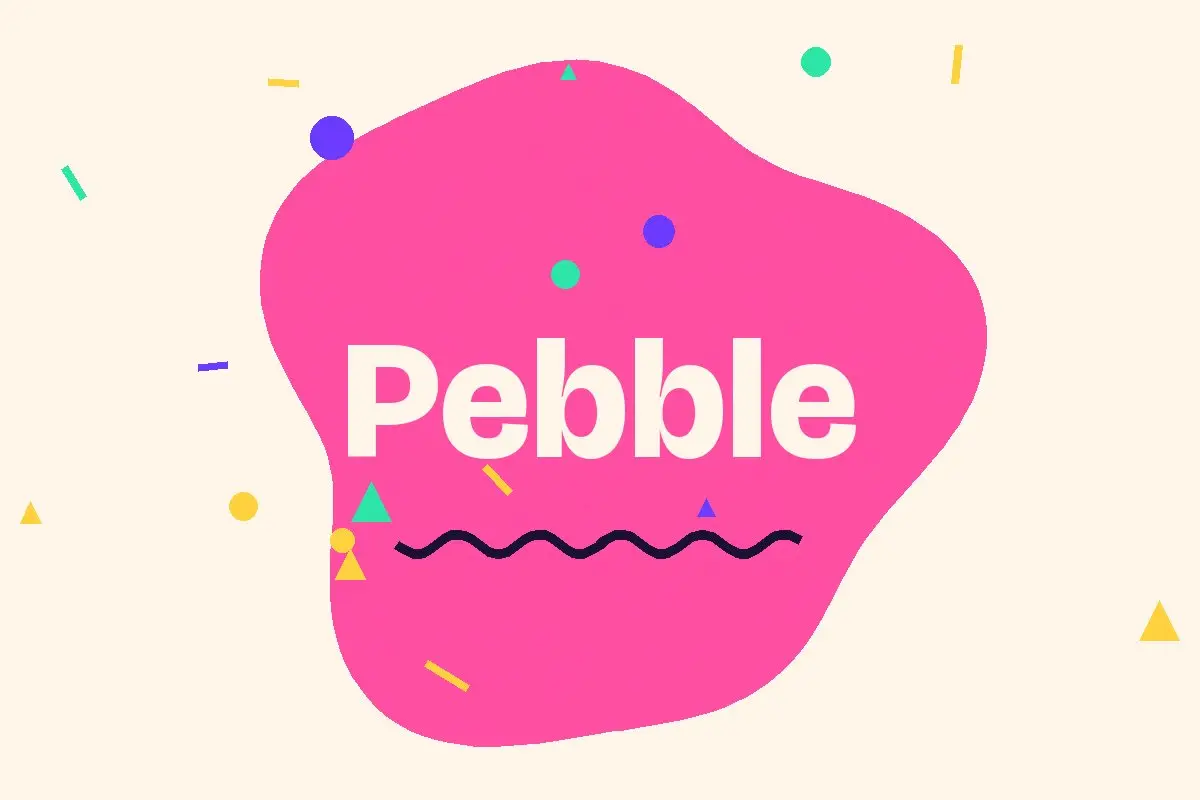
We drew a soft, rounded wordmark that sits inside a pebble shape which slowly changes as your savings grow. The palette went from one blue to five friendly colours, each tied to a savings goal.
- A wordmark and a living logo shape
- Five goal colours and an illustration kit
- App onboarding copy written with their support team
- Launch film and social templates
Our app store rating went from 3.9 to 4.7 in two months. People screenshot their pebble.
Head of Product, Pebble