Colour feels like the most mysterious part of design, but most good layouts follow a simple recipe: one main colour, one accent and plenty of neutral space in between.
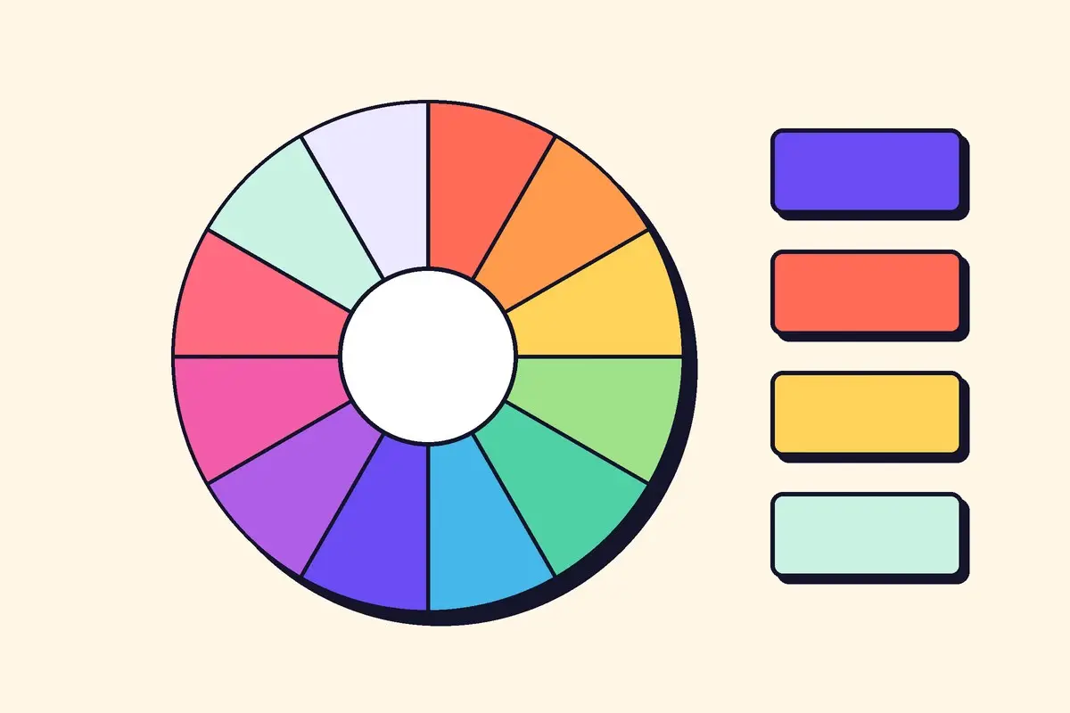
The 60-30-10 rule
- 60% neutral: backgrounds, white space, body text.
- 30% main colour: headings, panels, navigation.
- 10% accent: buttons, highlights, the one thing you want clicked.
The accent works because it is rare. The moment everything is highlighted, nothing is.
Check your contrast
Pale grey text on white looks elegant on a big monitor and disappears on a phone in sunlight. Aim for dark text on light backgrounds, and test anything important with a contrast checker before you publish.
If everything shouts, nobody hears the button.